![]()
I’ve been a user of Spotify now since 2017 and during that time I’ve created a myriad of playlists, most of which I’m willing to admit I haven’t touched in a long time. Generally speaking, my playlists fall into one of four categories.
First, and most predominantly, is based on time. I create bimonthly playlists in which I add songs I’ve enjoyed throughout the two months; at the end of the year, I’ll compile all 6 of those into a yearly round-up playlist. Second is based on music genre, I have playlists for each genre I listen to (of course there’s bound to be a bit of overlap). Third is based on language, I listen to a mixture of English, Japanese, Korean, and Cantonese songs. Fourth, and finally, are playlists created from song radios or other Spotify-generated means.
One thing that you might not know about Spotify is that it has an API that can be used by developers to create Spotify apps. It’s called the Spotify Web API and it allows you to control audio playback, manage your Spotify library, get metadata of tracks, artists, and albums, and so much more. I’m utilising the Spotipy Python library to use it. For my purposes I’ll be using it to get my playlists’ metadata and the audio features of tracks.
In this blog we’ll be going on a journey that explores my playlists in a data-driven way and eventually produce a machine learning algorithm that gives the most similar tracks in my playlists when provided with a track. All plots, where possible, will be made using Plotly (which produces interactive plots) so hover over them, click on them, and drag around on them - see what happens!
Data Overview
I’ve already done the hard work of collecting and processing the data for each track within my playlists as well as sourcing external data used to determine the genre(s) of tracks. In total, there are 7,842 rows and 32 columns. I’ve shown below a small extract of the data, with the most important columns, to get an idea of what we’re working with here:
| name | artist | popularity | playlist_name | playlist_date_added | danceability | energy | loudness | speechiness | acousticness | instrumentalness | liveness | valence | tempo | lang_jap | lang_kor | lang_can | lang_eng | pop | rock | hip_hop | indie | rap | alternative | |
|---|---|---|---|---|---|---|---|---|---|---|---|---|---|---|---|---|---|---|---|---|---|---|---|---|
| 1471 | Troubled Mind | Cannibal Kids | 49 | Indie Alt | 2018-10-02 | 0.566 | 0.540 | -10.639 | 0.043 | 0.008 | 0.026 | 0.067 | 0.609 | 165.082 | 0 | 0 | 0 | 1 | 0 | 0 | 0 | 1 | 0 | 0 |
| 3287 | Unfinished | KOTOKO | 0 | 2018 Complete Round Up | 2019-04-07 | 0.594 | 0.999 | -2.342 | 0.217 | 0.025 | 0.000 | 0.341 | 0.191 | 146.024 | 1 | 0 | 0 | 0 | 0 | 0 | 0 | 0 | 0 | 0 |
| 2622 | Tiny Little Adiantum - Remix | WildWestCartel | 16 | 2020 Complete Round Up | 2021-01-14 | 0.828 | 0.806 | -8.431 | 0.110 | 0.046 | 0.011 | 0.251 | 0.621 | 93.018 | 0 | 0 | 0 | 1 | 0 | 0 | 0 | 0 | 0 | 0 |
| 4225 | Expressions | Grey Oakes | 20 | November & December 2019 | 2019-11-08 | 0.772 | 0.564 | -4.502 | 0.060 | 0.497 | 0.000 | 0.345 | 0.649 | 91.999 | 0 | 0 | 0 | 1 | 0 | 0 | 0 | 0 | 0 | 0 |
| 7406 | Dollar - Cha Cha Version | Electric Guest | 29 | Indie Alt | 2020-01-05 | 0.743 | 0.604 | -7.823 | 0.128 | 0.599 | 0.000 | 0.119 | 0.726 | 95.017 | 0 | 0 | 0 | 1 | 1 | 1 | 0 | 1 | 0 | 1 |
Data Dictionary
You might be looking at some of those column names with no idea what they mean or represent, luckily Spotify does provide explanations for their audio features. And even luckier for you, I’ve created a data dictionary that describes what each column represents. Note, the language column was created used my language playlists and the genre column was created using data from Every Noise at Once.
| Column | Category | Description |
|---|---|---|
| name | Track Property | Name of the track. |
| artist | Track Property | Name of the artist. |
| popularity | Artist Property | The popularity of the artist. The value will be between 0 and 100, with 100 being the most popular. The artist’s popularity is calculated from the popularity of all the artist’s tracks. |
| playlist_name | Track Property | Name of playlist in which this track resides. |
| playlist_date_added | Track Property | Date and time when the track was added to playlist. |
| danceability | Mood | Danceability describes how suitable a track is for dancing based on a combination of musical elements including tempo, rhythm stability, beat strength, and overall regularity. A value of 0.0 is least danceable and 1.0 is most danceable. |
| energy | Mood | Energy is a measure from 0.0 to 1.0 and represents a perceptual measure of intensity and activity. Typically, energetic tracks feel fast, loud, and noisy. For example, death metal has high energy, while a Bach prelude scores low on the scale. Perceptual features contributing to this attribute include dynamic range, perceived loudness, timbre, onset rate, and general entropy. |
| loudness | Track Property | The overall loudness of a track in decibels (dB). Loudness values are averaged across the entire track and are useful for comparing relative loudness of tracks. Loudness is the quality of a sound that is the primary psychological correlate of physical strength (amplitude). Values typically range between -60 and 0 db. |
| speechiness | Track Property | Speechiness detects the presence of spoken words in a track. The more exclusively speech-like the recording (e.g. talk show, audio book, poetry), the closer to 1.0 the attribute value. Values above 0.66 describe tracks that are probably made entirely of spoken words. |
| acousticness | Context | A confidence measure from 0.0 to 1.0 of whether the track is acoustic. 1.0 represents high confidence the track is acoustic. |
| instrumentalness | Track Property | Predicts whether a track contains no vocals. “Ooh” and “aah” sounds are treated as instrumental in this context. Rap or spoken word tracks are clearly “vocal”. The closer the instrumentalness value is to 1.0, the greater likelihood the track contains no vocal content. |
| liveness | Context | Detects the presence of an audience in the recording. Higher liveness values represent an increased probability that the track was performed live. A value above 0.8 provides strong likelihood that the track is live. |
| valence | Mood | A measure from 0.0 to 1.0 describing the musical positiveness conveyed by a track. Tracks with high valence sound more positive (e.g. happy, cheerful, euphoric), while tracks with low valence sound more negative (e.g. sad, depressed, angry). |
| tempo | Mood | The overall estimated tempo of a track in beats per minute (BPM). In musical terminology, tempo is the speed or pace of a given piece and derives directly from the average beat duration. |
| lang_jap | Language | Whether the track features Japanese language, binary value of 0 or 1. |
| lang_kor | Language | Whether the track features Korean language, binary value of 0 or 1. |
| lang_can | Language | Whether the track features Cantonese language, binary value of 0 or 1. |
| lang_eng | Language | If a track doesn’t feature Japanese, Korean, or Cantonese it’s assumed to be English. Binary value of 0 or 1. |
| pop | Genre | Binary value that describes whether a track’s artist is labelled as pop. |
| rock | Genre | Binary value that describes whether a track’s artist is labelled as rock. |
| hip_hop | Genre | Binary value that describes whether a track’s artist is labelled as hip-hop. |
| indie | Genre | Binary value that describes whether a track’s artist is labelled as indie. |
| rap | Genre | Binary value that describes whether a track’s artist is labelled as rap. |
| alternative | Genre | Binary value that describes whether a track’s artist is labelled as alternative. |
Exploratory Data Analysis
In this section we’ll begin to explore the data and extract out some insights that will help us to reach our eventual goal of identifying similar songs across playlists.
Starting Simple with Univariate Analysis
It’s always good to start with simple descriptive analysis to get a feel for the data. Let’s first start by looking at how many tracks are in each playlist.
Clearly 2019 was a good year for music with 973 tracks being added to the ‘2019 Complete Round Up’ throughout the year. That’s 2.7 tracks per day on average! I’m quite picky with the tracks I’ll add to my bimonthly playists, I’d give an estimate of 1 track being added for every 15 tracks listened to - going by that I was listening to about 41 new tracks every day. For some context, 2019 was when I was finishing my master’s degree in Data Science during which I was listening to music while studying.
Let’s take a look at the distribution of the features in the dataset. For a baseline comparison, I’ve downloaded a Kaggle dataset containing Spotify audio features of more than 580k tracks which has a great deal more than the ~8k tracks in our dataset. It contains tracks released from the 1920s to 2022 across a variety of genres with over 110k unique artists, making it a good baseline to compare statistics.
Danceability is commonly defined as how ‘danceable’ a track is and there’s much subjectivity involved in determining this. Spotify has defined it based on a combination of musical elements including tempo, rhythm stability, beat strength, and overall regularity. A value of 0.0 is least danceable and 1.0 is most danceable.
The median value (value in the middle when sorted in ascending order) in our dataset is 0.64 and the middle half of the data (quartile 1 to 3) is between 0.52 and 0.73. To compare with the Kaggle dataset, we can say that, on average, the tracks in my dataset are more danceable than the Kaggle dataset. The mean values between the two datasets are statistically significant at the 0.1% level using Welch’s t-test.
Energy is a measure from 0.0 to 1.0 and represents a perceptual measure of intensity and activity. Typically, energetic tracks feel fast, loud, and noisy.
The median value is 0.64 and the middle half of the data (quartile 1 to 3) is between 0.49 and 0.79. If you were to pick a random song from all of the above playlists pooled together, there’s a good chance it’s got a decent level of energy (decent being defined as 0.55 and above, the median value from the Kaggle dataset). The mean values between the two datasets are statistically significant at the 0.1% level using Welch’s t-test.
Interestingly, the distribution seems as if it’s been right censored due to the upper bound of 1.
Valence is a measure from 0.0 to 1.0 describing the musical positiveness conveyed by a track. High valence means more positive sounding (happy, cheerful, etc.) while low valence sounds more negative (sad, angry, etc.)
This is an interesting distribution; the median lies pretty much exactly in the middle with a value of 0.4995. The middle half of the data has lies between 0.333 and 0.687 which pretty much covers the middle third of the bounds. In essence, this is telling me that half my tracks are neutral, one quarter are sad/angry/depressed sounding (have a value of below 0.333), and one quarter are happy/cheerful/euphoric sounding (have a value of above 0.687).
Comparing medians with the Kaggle dataset, it does seem that my tracks are on average a little less positive sounding. The mean values between the two datasets are statistically significant at the 0.1% level using Welch’s t-test.
This feature represents the overall estimated tempo of a track in beats per minute (BPM).
The median BPM of tracks is about 120 BPM with 50% of tracks being between 98 and 140 BPM. This almost exactly aligns with an article from MasterClass that states: “Most of today’s popular songs are written in a tempo range of 100 to 140 BPM”.
Comparing with the medians Kaggle dataset we find that the two are very close (120 BPM vs 117 BMP). The mean values between the two datasets are also statistically significant at the 0.1% level using Welch’s t-test.
Haven’t got too much to say about this, it makes sense that there will be a lower-bound BPM threshold that most tracks will be above and conversely an upper-bound threshold that most tracks will be below. I’d imagine this distribution would drastically change if someone were to exclusively listen to EDM, Techno, or similar high-tempo genres.
The overall loudness of a track in decibels (dB). This looks like a textbook example of a left (or negative) skewed distribution. It does seem that, on average, the tracks in my dataset are louder than the ones in the Kaggle dataset (-6.6 dB vs -9.2 dB). Additionally, the mean values between the two datasets are statistically significant at the 0.1% level using Welch’s t-test.
I don’t know enough about decibels in the context of music mixing and mastering (or any context for that matter) to meaningfully comment on this.
Here we’ve got the distribution of track durations in seconds. This looks like a normal-ish distribution with a long tail on the right (we can test to see how close it is to a normal distribution using a Q-Q plot but I’ll skip that here).
What we can get from this is that the median track length is 3 minutes and 45 seconds and half of the tracks have a duration between 3 minutes and 11 seconds and 4 minutes and 19 seconds. I’ve got one track on the very far right that has a duration of 13 minutes and 44 seconds.
Comparing with the Kaggle dataset we find that the median track durations are very similar (3 minutes and 35 seconds for Kaggle). When performing Welch’s t-test, we cannot reject the null hypothesis that the two means are the same at the 1% significance level.
Spotify has a measure for the popularity of an artist which will be between 0 and 100, with 100 being the most popular. The artist’s popularity is calculated from the popularity of all the artist’s tracks.
I’ve de-duplicated the data based on artists so we’ll have one row (track) per artist to see the distribution of artist popularity. Not-so-surprisingly about 33% of the artists I listen to have a popularity value of 0. Those look to be artists/bands with small followings.
Doing the same for the Kaggle dataset, we find that only 9% of artists have a popularity of 0. On average, tracks from my dataset are less popular than the ones from the Kaggle dataset (26 vs 35). Given that the distribution is non-Gaussian, it isn’t appropriate to use Welch’s t-test to test whether the means are the same between the two datasets. It’s more appropriate to use the Mann-Whitney U test which tells us that the distributions of the two are not identical at the 0.1% significance level.
Genre is a bit of a funny one since it’s not representing the genre(s) of the track, but rather the genre(s) of the track’s artist. While this isn’t perfect, it does act as a good enough proxy for our purposes. Note that a track’s artist can be assigned more than one genre.
At first glance it does seem like Pop is the most common genre but I think it needs to be remembered that Pop is probably the most paired/combined genre (e.g., Pop Rock or Indie Pop).
Unfortunately Spotify’s API doesn’t provide any metadata on the language of a track. Luckily I have language based playlists, and from that I can say any tracks that aren’t in those playlists are English tracks. That probably works for, let’s say, roughly 90% of them.
Moving to Two Dimensions with Bivariate Analysis
Correlation Analysis
While we managed to learn about the features individually in the analysis above, we didn’t touch on the relationship between two features (if there is even a relationship). One way we can compactly visualise whether pairings of features have a relationship is to construct an N×N correlation matrix where N is the number of features.
There are several different measures that can be used to calculate the correlation between two variables, the de facto standard is Pearson’s correlation coefficient which measures the strength and direction of the linear relationship between two continuous variables. Another measure is Spearman’s rank correlation coefficient which is a nonparametric measure of rank correlation; in other words, it measures the correlation between the rankings of two variables (a good visual example of this is on its Wikipedia page). Unlike Pearson’s r, Spearmans’ ρ can be used to assess monotonic relationships (linear relationships are a subset of these) for both continuous and discrete ordinal (ranked order) variables.
Very recently, in March 2019, a new measure of correlation was unveiled that is able both capture non-linear dependencies and work consistently between categorical, ordinal, and continuous variables. It is named 𝜙K (PhiK) and the technical details, alongside a few practical examples, are found in its paper. Unlike both Pearson’s r and Spearman’s ρ, 𝜙K is bounded between 0 and 1 which tells us the strength but not the direction of a relationship. This is because direction isn’t well-defined for a non-monotonic relationship, as you’ll see below.
I’ve created a graph below to compare the three correlation coefficients on synthetic datasets (which is based on the first image from Wikipedia’s page on Correlation). As you can see, the last two rows of charts are all non-linear relationships between x and y which, as expected, result in a correlation coefficient value of zero for both Pearson’s r and Spearman’s ρ. On the other hand, 𝜙K is able to identify these relationships and the values produced are statistically significant at the 0.1% level. Exciting stuff!
P-values are in the brackets next to the calculated correlation coefficient values, this is used to determine whether the values are statistically significant or not at a pre-defined significance level.
The ρ in ‘True ρ’ in the first row of charts represents the population Pearson correlation coefficient and not Spearman’s ρ.
For a sample of data from the population, r is used instead of ρ and is referred to as the sample Pearson correlation coefficient.
Armed with these tools, let’s go ahead and use them to create correlation matrices for the Spotify audio features.
There’s not much of a difference when comparing the Pearson and Spearman correlation matrices but looking at the 𝜙K matrix unveils a non-linear relationship between tempo and danceability that wasn’t captured by the first two measures. I’ve made a table below that pick out pairs of features with an absolute correlation value of 0.5 or above for any of the three measures.
| Feature 1 | Feature 2 | PhiK | Pearson | Spearman | |
|---|---|---|---|---|---|
| 1 | energy | loudness | 0.80 | 0.78 | 0.77 |
| 2 | energy | acousticness | 0.67 | -0.62 | -0.62 |
| 3 | loudness | acousticness | 0.56 | -0.52 | -0.50 |
| 0 | danceability | tempo | 0.51 | -0.22 | -0.16 |
A thing to keep in mind is that these are summary statistics, to get the full picture we need to take a look at the scatterplot of feature pairs.
There’s a strong positive and almost linear correlation between energy and loudness which makes sense because energy measures the intensity of a track and loud tracks can be thought to be of as more intense. Note that energy is a measure that’s calculated by Spotify so there’s a good chance that it’s a function of loudness and some other track properties.
There seems to be a moderate negative correlation between the energy of a track and the confidence of whether a track is acoustic. Acoustic music is music that mainly uses unamplified instruments that produce sound only by acoustic means. This means no electric or virtual instruments. As you can imagine, acoustic tracks would have a lower energy compared to tracks that utilise electric or electronic instruments, so this correlation makes sense to me.
Similar logic for the correlation between energy and acousticness applies here.
This one is an interesting one. Going by the LOWESS (Locally Weighted Scatterplot Smoothing) trendline, there seems to be sweet-spot in tempo where the most danceable tracks are. Going back to the definition of danceability, it’s calculated based on a combination of tempo, rhythm stability, beat strength, and overall regularity. We know that there’s a definitive relationship between the two variables, and from the below chart we can clearly see it’s a non-linear relationship.
Analysis by Time, Playlist, and Genre
Let’s now analyse the how Spotify audio features change throughout time, how they vary by playlists (only considering the major ones), and whether different genres can be distinguished solely through these features.
Here we’re looking at how my music taste changes over the years. It’s immediately clear 2022 (up until August) has included more energetic and valent tracks (what I’d like to call ‘positive vibes’) marked by the median values and tighter inter-quartile range.
I’ve plotted the boxplots with a notch representing the 95% confidence interval of the median which offers a rough guide of the significance of the difference of medians; if the notches of two boxes do not overlap, this will provide evidence of a statistically significant difference between the medians. Thus, we can say that there is a statistically significant difference in medians at the 5% level in the medians between 2021 and 2022 for the energy and valence features.
Looking at my larger playlists based on language and genre, it’s possible to see distinct characteristic feature profiles of the playlists.
Let’s take the Upbeat playlist as an example; it’s characterised by tracks with high energy (median 0.88), tempo (median 145 BPM), and loudness (median -5.8 dB). On the other hand, the Chill playlist is characterised by tracks with low energy (median 0.45), valence (median 0.38), tempo (median 111 BPM), and loudness (median -9.8 dB) compared to other playlists.
Unsurprisingly, the Rap/HipHop/Trap and Pop playlists rank the highest for danceability on average and are tied third for energy. Pop takes a close second for valence, meaning it ranks second for ‘positive vibes’. Surprisingly the Japanese playlist takes second place when considering energy, tracks on average being 27% more ‘energetic’ than tracks in the former two playlists. It also ranks first in both valence and loudness, being the most positive and loud out of the playlists.
Turning our attention towards the genre, we want to see if we can identify a characteristic feature profile for the six different genres in our dataset - much like we did with the playlists. Recall that the genres represent the genres of the track’s artists and not the genre of the track. This does mean that the analysis results below are estimates through a proxy.
At first glance we can see that instrumentalness, tempo, liveliness and (to a lesser extent) valence do not vary significantly enough to be useful for distinguishing genres.
The Hip Hop and Rap genres have near identical feature profiles; this can be partially attributed to a large overlap of tracks in both as 24% of Rap tracks are also labelled as Hip Hop and 36% of Hip Hop tracks are also labelled as Rap. I’m not exactly too sure the other reason without a deep dive into this particular area.
Rock has tracks with the highest energy and loudness and the lowest danceability and acousticness on average; it has a very similar feature profile to the Alternative genre (later on we’ll see there’s significant overlap between these two genres as well).
Finally, we have the Pop and Indie genres, upon closer inspection we can see that these too are also similar in their feature profiles. Interesting how that turned out huh?
Genre Analysis
This is where things will start to get a little wavy. Technically speaking, Indie and Alternative are not genres - they’re more along the lines of a set of ideas and beliefs as opposed to a defined musical style. I’ve chosen to include them as genres because they both capture attributes of a track that cannot be captured by the other genres in the dataset. This will ultimately help with the end goal of creating a model that recommends similar tracks from my playlists given a track.
Take into consideration that genres are not mutually exclusive. Pop Rock is a fusion genre that combines elements of both the Pop and Rock genres. Indie Pop is a sub-genre of Pop that typically combines guitar pop with a more ‘home-grown’ melody compared to mainstream Pop. Rap Rock is another fusion genre that fuses the heavy guitar riffs associated with Rock tracks with the vocal and instrumental elements of Hip Hop (this is actually a genre, I didn’t make that up). The difference between Hip Hop and Rap can be confusing as well, with many people confusing them to be the same thing.
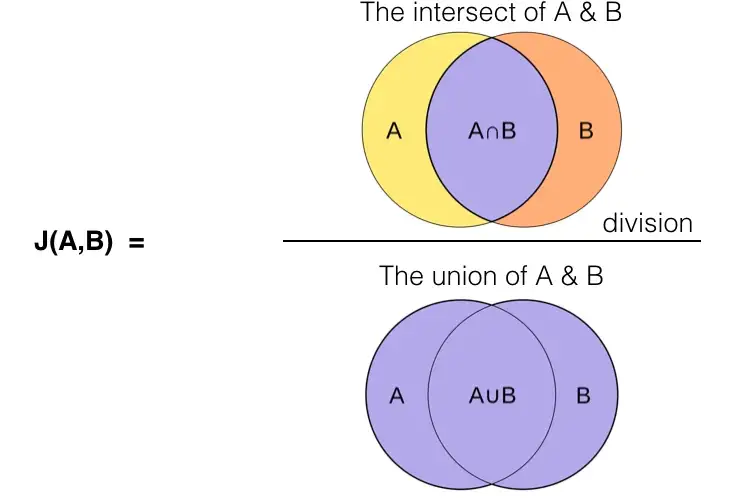
So, the question to answer in this section is, which genres are seen paired the most in our dataset? To answer this question, I’ll be using the Jaccard index (also known as Jaccard similarity coefficient) to see which genres co-occur most frequently. This is typically used as a performance metric in object detection computer vision problems to assess how well the bounding boxes predicted by a model match with the ground-truth, but it’s perfectly applicable in this situation.
To calculate the Jaccard index, we simply take the number of tracks which have both genres (e.g., tracks that are both Pop and Rock) and divide that by the number of tracks that are either genre (e.g., total number of all Pop tracks and all Rock tracks).
Below I’ve created a matrix which contains the Jaccard index for each pair of genres. We can see that, from most paired to least paired, the following genres co-occur frequently:
- Hip Hop and Rap
- Alternative and Rock
- Indie and Rock
- Indie and Pop
- Alternative and Indie
- Pop and Rock
More Dimensions!
Visualising data beyond two dimensions can result in figures that are information dense. Depending on the objective of the visualisation, this can be either a good or bad thing. In this case, I want to provide you with a figure that you can play around and interact with - the 3D scatter plot chart fulfils this objective nicely.
Below I’ve made a 3D plot of danceability, energy, and valence with tempo being used as the colour of the points. Note that all the information in this plot is contained in the previous sections.
Dimensionality Reduction
What if we’d like to visualise a large number of features at once? It becomes increasingly difficult to add more dimensions in a single graph, though you could employ tricks such as using the size of points as a dimension (think bubble plots), different markers for categories, opacity, etc. Visualising 5 or more dimensions becomes infeasible due to the increasingly information density of the resulting chart.
So, what can you do? 2D graphs are the de facto standard when it comes to data visualisation; one idea we can employ is to perform dimensionality reduction to essentially ‘compress’ the information of the dataset down into just two dimensions which we can then use a scatter plot to visualise. There are several different techniques under the dimensionality reduction umbrella, with Principal Component Analysis (PCA), T-distributed Stochastic Neighbor Embedding (t-SNE), and Uniform Manifold Approximation and Projection (UMAP) being a few of the more popular techniques.
I’ll be using UMAP on our dataset on different feature sets to see how the reduced dataset (known as embeddings) appears, the aim is to find a set of features which allow us to identify clusters of tracks that are similar in attributes. PCA isn’t appropriate to use as it isn’t able to handle categorical variables due to its underlying linearity assumptions and t-SNE is much slower compared to UMAP with the end results being sensitive to the settings used.
There doesn’t seem to be any identifiable clusters using only Spotify audio features; however, it does seem as if there’s a honeycomb-like structure appearing in the 2D embedding.
Tip - hover over the individual data points to see the track name and artist.
Adding the language indicators separates the embedding out into five distinct clusters, four clusters representing a language but it seems we have an additional small cluster comprised of Japanese and Korean songs interestingly. This is better than only using Spotify track audio features but it puts too much emphasis on languges. We can do better.
Finally, let’s add genre indicators into the mix. Doing so results in many small clusters, each of which represents a combination of language and genres. Tracks close to one another within a cluster share similar Spotify audio feature values. We’ve achieved our goal of identifying clusters of similar tracks!
Tip - click and drag to zoom into a cluster, double click to reset the figure.
To visualise what the clusters represent, we can look at each indicator attribute (i.e., langugages and genres) and see which clusters correspond to them.
Conclusion
We’ve reached the end of this article! Let’s take a step back and look at what we achieved throughout:
- Analysed and compared individual Spotify audio features of my tracks to a much larger dataset of tracks from Kaggle
- Performed correlation analysis to understand relationships between audio features
- Analysed how the features changed throughout the years and uncovered distinct characteristic feature profiles of major playlists and genres
- Identified genres that commonly pair together
- Performed dimensionality reduction to produce clusters of similar tracks
In the next part of this series, we’ll be creating a small recommender system that will recommend tracks from my playlists given an input track. Included will be an interactive demo!