| Product Name | Week Commencing Monday | Primary Category | Secondary Category | Tertiary Category | Quaternary Category | Price per Unit (£) | |
|---|---|---|---|---|---|---|---|
| 0 | Tesco Ground Cinnamon 40G Jar | 2022-02-28 | food-cupboard | cooking-ingredients | seasoning-herbs-and-spices | spices | 0.85 |
| 1 | Tesco Ground Cinnamon 40G Jar | 2022-03-07 | food-cupboard | cooking-ingredients | seasoning-herbs-and-spices | spices | 0.85 |
| 2 | Tesco Ground Cinnamon 40G Jar | 2022-03-14 | food-cupboard | cooking-ingredients | seasoning-herbs-and-spices | spices | 0.85 |

Disclaimer: The use of data collected for this study is covered by the Intellectual Property Office’s Exceptions to Copyright for Non-Commercial Research and Private Study. No personal information has been collected as part of this study’s data collection process and web scraping best practices implemented to the best of the author’s abilities. The collected data will be inaccessible to the public to abide by Section 7 of the Terms and Conditions agreement laid out by Tesco PLC.
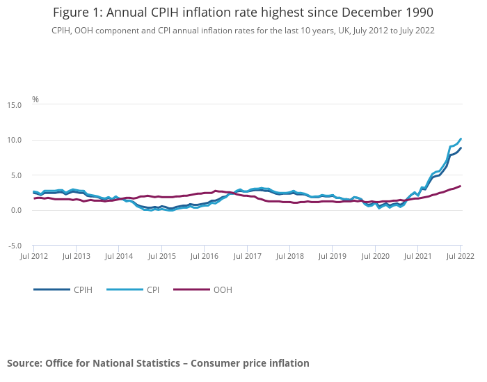
Since July 2021 the Consumer Prices Index (CPI) inflation rate in the UK has broken away from the Bank of England’s target rate of 2%, steadily rising month by month. As of 3rd September 2022, the inflation rate stands at 10.1% with no indication of decreasing. What an awfully depressing way to start a blog post but unfortunately this is the reality that we are all currently facing in the UK. Every month the Office for National Statistics (ONS) calculates CPI by collecting the prices for a basket of around 730 different consumer goods and services that is a representation of the society’s current buying habits and measures the average change in price of the basket on a year-over-year basis. At a risk of grossly simplifying, CPI tells us how much prices in general have changed over the last 12 months.
That’s all nice and well but society’s buying habits doesn’t necessarily reflect my buying habits. There are 12 broad categories of goods and services in the CPI basket, some of these categories such as clothing and footwear, and furniture and household goods don’t apply to me as I rarely ever buy new clothes or furniture. The full list of categories and goods and services of each category can be found on the ONS website here. One category that does apply to me, and to everyone else, is food and drinks. Food and drink goods (excluding alcohol) currently account for 9.3% of the weighting in CPI, which is a relatively small slice of the pie.
During recent times I’ve noticed that my shopping bill has gone up overall but I can’t quite pin down what items are contributing the most to this increase. To this end, I’ve built a cloud-based web-scraping application that scrapes product data from Tesco’s website including price and categories (GitHub link - blog article incoming). The reason why I chose Tesco as opposed to any other supermarket is because it’s 5 minutes down the road from me.
In this article we’ll load, process, transform, and analyse this scraped data to see how the prices of food categories have changed over time. If you want to skip directly to the charts and analysis, head to the ‘Charts and Analysis’ section in the above table of contents.
Data Overview and Processing
The web-scraping pipeline was run on a near daily basis from 28th February 2022 to 13th June 2022, giving me 90 day’s worth of data. For each day, the names, price per unit and price per weight or quantity, product category and subcategories, promotional offers, and club card prices were collected. All prices are in pound sterling (£). The way that Tesco categorises products is through a primary (or parent) category followed by 3 subcategories, each more granular than the last.
The scraped data from Tesco is in the following format:
| Product Name | Date | Primary Category | Secondary Category | Tertiary Category | Quaternary Category | Price per Unit (£) | Price per Weight or Quantity (£) | Weight or Quantity Unit | Clubcard Price per Unit (£) | Clubcard Discount (%) | Promotional Offer | |
|---|---|---|---|---|---|---|---|---|---|---|---|---|
| 0 | Tesco Macaroni Pasta 1Kg | 2022-02-28 | food-cupboard | dried-pasta-rice-noodles-and-cous-cous | pasta-and-spaghetti | pasta-macaroni-penne-and-rigatoni | 1.3 | 1.30 | kg | None | None | None |
| 1 | Canderel 5 Refill Sachets 500Pk | 2022-02-28 | food-cupboard | home-baking-and-sugar | sweeteners-and-sugar-substitutes | sweetener-tablets | 5.1 | 120.00 | kg | None | None | None |
| 2 | Highland Still Spring Water 12 X 330Ml | 2022-02-28 | drinks | water | still-water | small-still-water | 2.5 | 0.06 | 100ml | None | None | None |
In its current state, the data is too granular to work with. It’s reasonable to assume that the price of vast majority of products don’t change on a day to day basis, so we’ll transform the data into a weekly format where we’ll take the median price of a product for the entire week commencing on Monday as the aggregation function.
This will account for any pricing errors from Tesco’s pricing department which could dramatically skew the mean value (e.g., accidentally setting the price of a bag of 5kg basmati rice as £500 instead of £5.00 for a day before being corrected will affect the weekly mean price but not the weekly median price). We’ll also drop out columns that aren’t needed for this piece of analysis. Namely the club card, promotional offer, and weight/quantity columns.
Once transformed, we’ll take the example of the first 3 weeks of data for Tesco Ground Cinnamon (40G Jar) to see the format of the processed data:
Not much of a change when looking at 3 weeks worth of data for this product. While we’re at it, let’s take a look at how many different subcategories each main categories has:
| Primary Category | Number of Secondary Categories | Number of Tertiary Categories | Number of Quaternary Categories | |
|---|---|---|---|---|
| 0 | fresh-food | 19 | 180 | 606 |
| 1 | drinks | 18 | 77 | 272 |
| 2 | food-cupboard | 18 | 173 | 682 |
| 3 | bakery | 10 | 52 | 78 |
| 4 | frozen-food | 15 | 76 | 148 |
It’s very clear that fresh food and food cupboard main categories have the largest amount of products judging by the number of quaternary categories they have. The bakery main category seems to be the smallest with not much of an increase going from tertiarty to quaternary categories.
Calculating Index Numbers
Before we can go on with our analysis, we need to first understand what index numbers are and why they’re used, and how we can use it in the context of this analysis piece.
In essence, index numbers are used to measure changes and simplify comparisons. In particular, they’re used in the field of economics to measure changes in price (i.e., inflation or deflation) and changes in quantity (e.g., sales volumes or economic output). The way that index numbers are calculated is to take a base value from a particular point in time and determine the ratio between the base value and a value from a future point in time.
As an example, imagine we want to understand how much the price of a standard Oreo McFlurry from McDonalds changes over time. I’d go into my local store one day and note the price down, let’s say it’s £0.80. I come back 2 months later and the price has gone up to £1.00. To calculate the index, we would need to divide the new price by the base price and multiply the result by 100, which would give us 125. We interpret this as a 25% increase in price over the 2-month time period. Of course, I could go in another 2 months later, note the price, and calculate another index number using the base price to see how the price has changed over a 4-month time period.
This line of thinking can be naturally extended to consider baskets of products instead of a singular product by taking the sum of the prices of products in the basket.
In fact, that’s exactly what we’ll do. For each of the primary, secondary, tertiary, and quaternary categories we’ll calculate the total value of the basket of products and use that to calculate the index numbers. But hang on a moment here, what if Tesco decides to de-list a product and stop selling it - what happens then? It’ll mean that the total basket value is no longer comparable between different points in time, meaning that the index numbers are misleading. To combat this, I’ve only taken products within categories that are present across all of the weeks in the dataset so that the total value of a category’s basket is comparable across time. any subcategories that have less than 5 items are excluded to save on processing time.
At the end of this processing step, we’ll have 4 datasets, one for each level of category granularity:
| Week Commencing Monday | Primary Category | Total Basket Value (£) | Index | |
|---|---|---|---|---|
| 0 | 2022-02-28 | fresh-food | 6298.79 | 100.00 |
| 1 | 2022-03-07 | fresh-food | 6306.64 | 100.12 |
| 2 | 2022-03-14 | fresh-food | 6311.60 | 100.20 |
| Week Commencing Monday | Primary Category | Secondary Category | Total Basket Value (£) | Index | |
|---|---|---|---|---|---|
| 0 | 2022-02-28 | fresh-food | fresh-meat-and-poultry | 1252.15 | 100.00 |
| 1 | 2022-03-07 | fresh-food | fresh-meat-and-poultry | 1252.32 | 100.01 |
| 2 | 2022-03-14 | fresh-food | fresh-meat-and-poultry | 1254.22 | 100.17 |
| Week Commencing Monday | Primary Category | Secondary Category | Tertiary Category | Total Basket Value (£) | Index | |
|---|---|---|---|---|---|---|
| 0 | 2022-02-28 | fresh-food | fresh-meat-and-poultry | fresh-chicken | 172.34 | 100.0 |
| 1 | 2022-03-07 | fresh-food | fresh-meat-and-poultry | fresh-chicken | 172.51 | 100.1 |
| 2 | 2022-03-14 | fresh-food | fresh-meat-and-poultry | fresh-chicken | 172.51 | 100.1 |
| Week Commencing Monday | Primary Category | Secondary Category | Tertiary Category | Quaternary Category | Total Basket Value | Index | |
|---|---|---|---|---|---|---|---|
| 0 | 2022-02-28 | fresh-food | fresh-meat-and-poultry | fresh-chicken | chicken-breast | 42.53 | 100.0 |
| 1 | 2022-03-07 | fresh-food | fresh-meat-and-poultry | fresh-chicken | chicken-breast | 42.53 | 100.0 |
| 2 | 2022-03-14 | fresh-food | fresh-meat-and-poultry | fresh-chicken | chicken-breast | 42.53 | 100.0 |
Charts and Analysis
Overview of Price Changes for All Categories
Let’s start with the big picture (quite literally), how did prices change when comparing the basket values of categories?
This chart is interactive!
Hover your mouse over the sector to look at the index number of categories (if on mobile, tap and hold the name of the category). Clicking on a sector will focus on that particular category and its subcategories. There are 4 levels of categories but only 3 levels are shown at any one time for better performance.
The index numbers presented in the graph below are accurate when rounding to whole numbers!
Technical explanation - The numbers get more inaccurate as you go up category granularities due to the way that the index numbers are aggregated. I’m using the most granular dataset that contains index numbers of quaternary categories, these are then aggregated up to the tertiary category level using the harmonic mean weighted by the basket value of the quaternary categories within the tertiary category. This process repeats for the secondary and then the primary categories, the approximation error increasing going up with each category level.
Straight away we can see that fresh food and frozen food have increased by ~3% and ~4% respectively. The major contributing subcategories for fresh food are cheese (~5% increase); fresh meat and poultry (~5% increase); ready meals (~4% increase); and yogurts (~4% increase). For frozen food, the major contributing subcategories are frozen fish and seafood (~9% increase); frozen chips, onion rings, potatoes, and rice (~12% increase); and frozen meat and poultry (~5% increase).
Yikes, no wonder why my shopping bill has been going up. Fresh chicken breast and thighs have gone up by over 10%!
Overall, prices have by 1.7% across all categories and products in the processed dataset.
We can also see there are a few secondary categories that have gone down, most notably is the cooking sauces, meal kits, and sides subcategory within the food cupboard category which has gone down by ~2%. This does raise another question though, how many categories in each level experienced an increase, decrease, or no change in price?
It’s very clear from the above that the bakery and frozen food primary categories had all secondary, tertiary, and quaternary subcategories either increase in price or stay the same! We’ll have to note that they’re the two smallest primary categories by both total basket value and number of subcategories, but there are ongoing macroeconomic events that are affecting both the supply chain and cost of businesses.
As of writing, the 2022 Russian invasion of Ukraine is affecting the two largest global suppliers of wheat. Russia produces 11% of the world’s wheat and accounts for 19% of global wheat exports. On the other hand, Ukraine produces 3% of the world’s wheat and accounts for 9% of global wheat exports. Both of these together account for more than a quarter of the world’s wheat export market.1 You can guess what ingredient bakery goods use that’s derived from wheat.
1 Source: https://asmith.ucdavis.edu/news/russia-ukraine
Energy prices have also been rising throughout 2022 and are forecasted to reach unprecedented levels during the first two quarters of 2023. The electricity price (kWh) cap rose from 20.8p in Q1 2022 to 28.3p in Q2 2022,2 an increase of 36%. This will affect the production costs of all goods, more so if they need to be kept cold or frozen.
2 Source: https://www.icaew.com/insights/viewpoints-on-the-news/2022/sept-2022/chart-of-the-week-energy-price-cap-update
Generally speaking, it does seem that the vast majority of subcategories have experienced an increase in price, no matter what level of category granularity is being looked at. The drinks and food cupboard primary categories are the least affected as they’re the only two that contain secondary categories that have decreased in price; that being said they only account for 11.1% and 18.8% of the total number of their respective total secondary categories.
Price Changes for Primary Food Categories
Let’s now take a look at how the index of primary categories changed over time as opposed to a snapshot in time.
There are a few things I’m seeing from this graph. First is that bakery, drinks, and food cupboard items seem to be plateauing where as fresh and frozen items don’t seem to be slowing down. Second, the fresh and frozen items have the highest rate of increase amongst all primary categories. Third, the food cupboard and drinks categories seem to increase at the same rate were it not for the initial hike on 6th March. Finally, the bakery category is the only one that looks to practically stay the same for the first five weeks before rapidly increasing at the same rate as the fresh and frozen food categories and then plateauing.
The big question that comes to mind is what’s driving the price of fresh food items to go up? If we extrapolate out the trend for an entire year, we’re looking at an approximate increase of 12.5% for both categories! To answer this question we’ll have to dive into the secondary categories.
Price Changes for Fresh Food Subcategories
Wow there’s a lot going on in that graph, but can definitely be seen that some secondary categories are increasing much more than others. Let’s take a look at the index values at the end of the graph to quickly look at which secondary categories increased the most.
| Week Commencing Monday | Primary Category | Secondary Category | Total Basket Value (£) | Index | |
|---|---|---|---|---|---|
| 0 | 2022-06-13 | fresh-food | cheese | 543.92 | 104.73 |
| 1 | 2022-06-13 | fresh-food | fresh-meat-and-poultry | 1311.26 | 104.72 |
| 2 | 2022-06-13 | fresh-food | yoghurts | 389.49 | 104.13 |
| 3 | 2022-06-13 | fresh-food | cooked-meats-antipasti-and-dips | 537.09 | 103.95 |
| 4 | 2022-06-13 | fresh-food | chilled-fish-and-seafood | 270.53 | 103.56 |
| 5 | 2022-06-13 | fresh-food | milk-butter-and-eggs | 324.88 | 103.14 |
| 6 | 2022-06-13 | fresh-food | ready-meals | 653.29 | 102.98 |
| 7 | 2022-06-13 | fresh-food | pies-pasties-quiches-and-snacking | 322.31 | 102.83 |
| 8 | 2022-06-13 | fresh-food | fresh-salad-coleslaw-and-sandwich-fillers | 152.96 | 102.35 |
| 9 | 2022-06-13 | fresh-food | chilled-vegetarian-and-vegan | 290.60 | 102.29 |
| 10 | 2022-06-13 | fresh-food | chilled-soup-sandwiches-and-salad-pots | 226.00 | 101.87 |
| 11 | 2022-06-13 | fresh-food | dairy-free-and-dairy-alternatives | 328.15 | 101.85 |
| 12 | 2022-06-13 | fresh-food | chilled-desserts | 275.90 | 101.80 |
| 13 | 2022-06-13 | fresh-food | fresh-vegetables | 164.09 | 101.74 |
| 14 | 2022-06-13 | fresh-food | juice-and-smoothies | 44.01 | 100.62 |
| 15 | 2022-06-13 | fresh-food | fresh-pizza-pasta-and-garlic-bread | 292.38 | 100.30 |
| 16 | 2022-06-13 | fresh-food | counters | 100.25 | 100.10 |
| 17 | 2022-06-13 | fresh-food | fresh-fruit | 239.01 | 100.10 |
Looking at the top 6 rows, it’s primarily dairy and fresh meat and poultry that’s driving up the index of fresh food items. Both of these being products produced from animals.
According to the Specialty Food Magazine, the price increase of dairy products can be largely attributed to the spiralling price of feed, fuel, and fertiliser.3 All of these three production costs have been subject to large price hikes. For feed and fertiliser, it can be attributed to the Russian invasion on Ukraine, higher energy costs, and increased global demand.4 For fuel, the primary driver is an increase in the refining cost of crude oil.5
3 Source: https://www.specialityfoodmagazine.com/news/dairy-crisis-threatens-spiralling-costs-of-cheese-and-milk-for-indies
4 Source: https://lordslibrary.parliament.uk/rising-cost-of-agricultural-fertiliser-and-feed-causes-impacts-and-government-policy/
5 Source: https://www.allstarcard.co.uk/news-insights/business/why-is-fuel-expensive/
In Specialty Food Magazine’s article they have a quote from the vice-chair of the National Union of Farmers that it takes him two and a half years to get a cow from being born to be actually producing milk which incurs a lot of cost over the time period. In order to maintain their profit margins, they must raise their prices.
Wrapping Up
So what have we learned from this exercise?
- pretty much everything sold by Tesco is going up, some more than others;
- the primary driver of the price increases stem from the underlying production costs of items;
- Tesco does not make it easy to scrape their website;
- web-scraping pipelines are in constant need of maintenance due to site changes.
That’s all for now, I’ll see you next time.
Bonus Graphs!
Thank you for making it all the way to the end! In this section I’ve put some extra graphs I created that I decided to not include in the main part of this article, mainly because it’s most of the same as above. Hope you enjoy.
Correlation Heatmap of All Secondary Categories
Note that the below graph is using Pearson’s Correlation coefficient. When the index of two subcategories move in tandem (i.e. they’ve got a positive correlation) the rectange will show as red, the stronger the correlation the more red the rectangle will be. Similar logic applies for when two subcategories move in opposite directions, except with blue. Interesting observation that the adult soft drink and mixers subcategory (first row/column) isn’t showing much of a correlation with anything else.